ABOUT
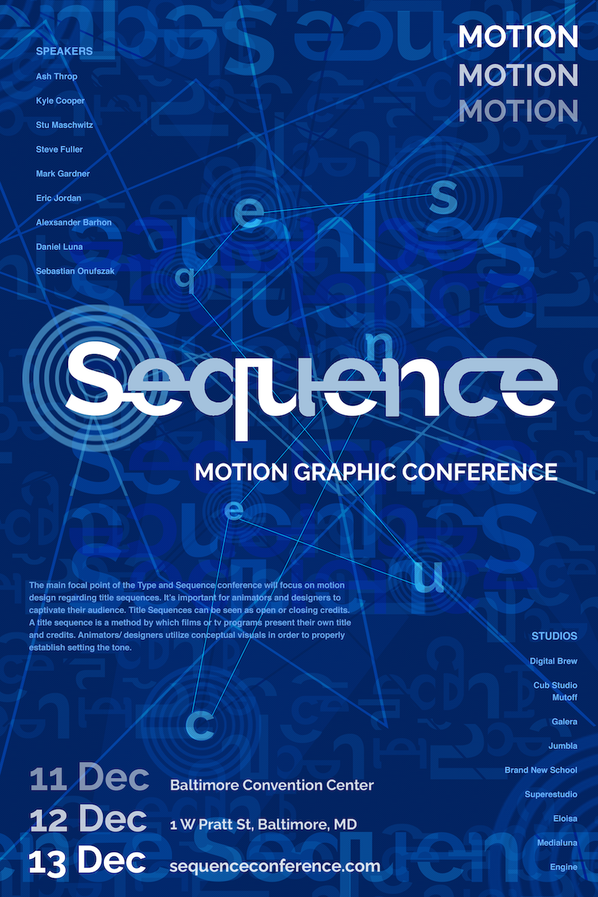
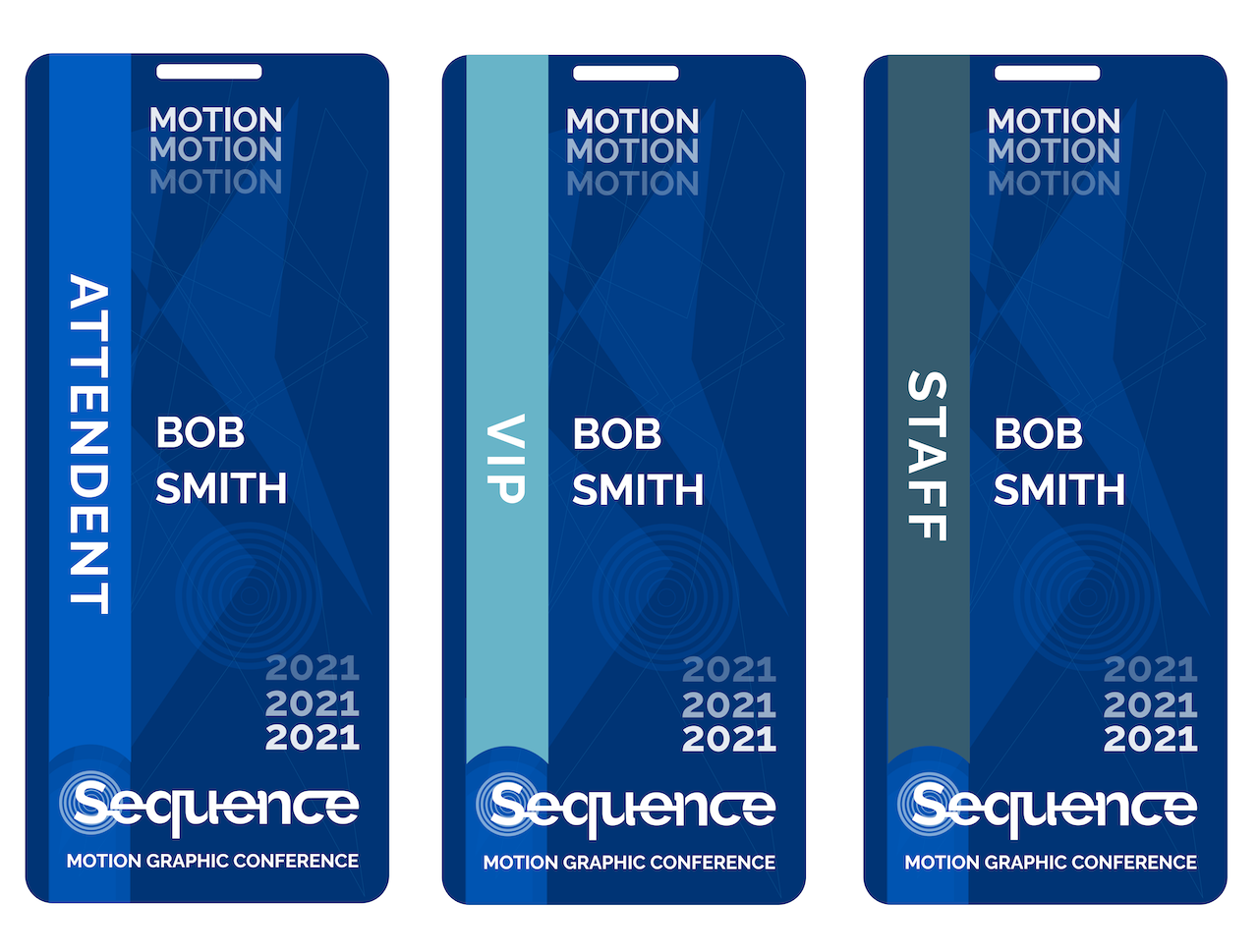
Sequence is a conceptual motion graphic conference where motion designers can express and share new ideas. I wanted to create a design where people could feel the sense of motion flowing throughout a poster into a branding concept. By implementing repeating words, I could use repetition to capture the flow of motion itself. The branding concept would apply to event passes, logo wear, and a promotional motion design.
CONCEPT
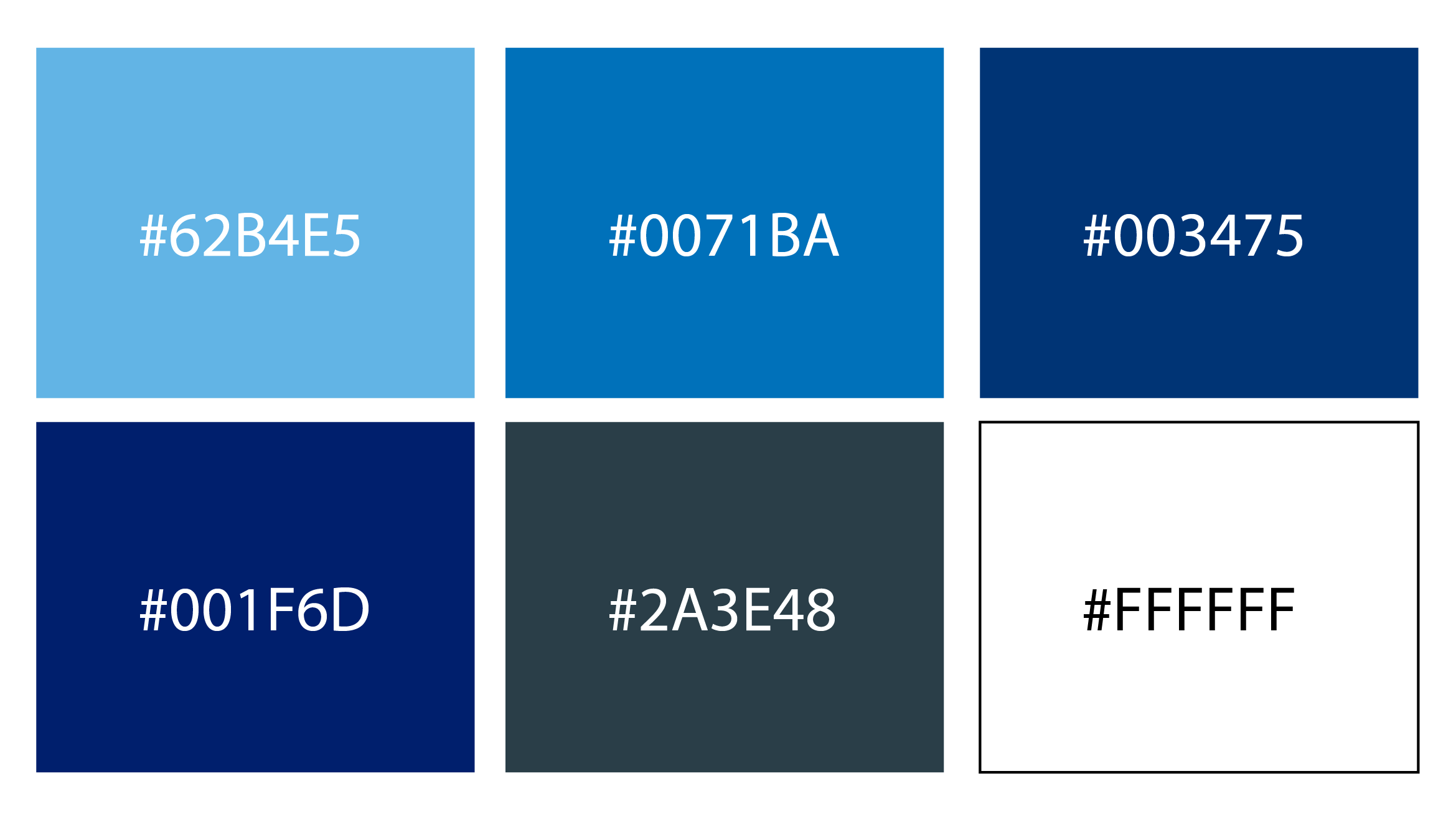
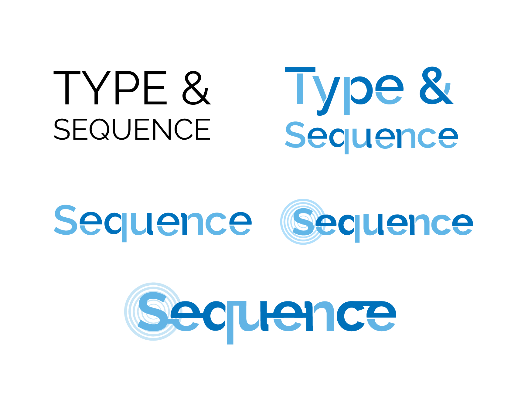
For my concept, I wanted to create a well-structured logo that had the element of motion. The typeface of the logo was a modified version of the font raleway. I decided to break up certain parts of each letter and uniquely connect each of them. In terms of colors, I thought blue stood out the most, which led me to implement white and a shade of blue throughout the typeface.

